So far this year, we have seen many famous brands like Fanta and Calvin Klein revamping their logos, some of whom have used techniques that are becoming more popular throughout 2017. As a result of this, we thought we’d compile a list of some of our favourite ideas in logo design seen this year, some of which we have used in the past ourselves.
| Before | After |
|---|---|
 |
 |
Minimalism
Minimalism is everywhere right now. With many brands such as Kodak and Mastercard simplifying their existing logos, other companies and brands have decided to take away any unnecessary details and just focus on the essential parts to keep up with the trend. Web designers and graphic designers both love it as it leaves potential customers wanting more.
| Before | After |
|---|---|
 |
 |
Capitalisation
This technique is probably one of the biggest trends so far this year. A lot of companies who have redesigned their logo this year have capitalised the writing, and it’s proved to be effective.
We mentioned earlier that Fanta had given their logo a revamp and capitalisation is one of the techniques used in the redesign. They’ve swapped the rounded cartoonish font to an upper case squared font, while still keeping the cartoonish element to it by using different sized letters. This approach helps make the logo seem more modern yet still recognisable – and, of course, minimal.
Colour (or Lack of It)

With minimalism on the rise, companies are going one of two ways with colours – they are either using bright colours and gradients to make simple logos more exciting or going for a black and white colour scheme to keep their logos simple.
The black and white trend can be observed in logos like Calvin Klein’s or the iPad logo – both of which have taken an extremely minimal approach.
On the other hand, some brands are taking a wholly different approach, and are adopting bright colours and using gradients in their designs. With this trend, many designers are using one or two vibrant colours to make an otherwise simple logo more appealing. By using no more than two colours, this keeps to the ever so popular minimal trend, while still making the logo that bit more interesting and eye-catching. Take the Yoga House logo, for example, they’ve used an orange and pink palette and have successfully met the goal of minimal, yet eye-catching.
Typography
Typography has been one of the most popular techniques in logo design, with many brands adopting a ‘text logo’ approach – logos that don’t include any graphics at all. There have been many different styles adopted so far this year, including stencil typography and decorative lettering:
Stencil typography
Some brands have opted for a text logo using broken letters, where they seem to have been painted using a traditional letter stencil.
Decorative Lettering
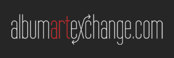
In an attempt to keep logos simple, while maintaining simplicity yet style, some companies have used more decorative fonts. Take Album Art Exchange, for example, they’ve kept their logo super simple, but their use of swashes on the letter ‘X’ has added extra meaning and interest to their design.
Line Art & Geometric Shapes

Geometric shapes have always been favoured among logo designers, and their popularity has risen considerably recently. They’re especially effective at creating stylish and unique designs that can appear to be quite involved but are actually somewhat simple and minimal. Line art is also proving to be quite popular too and helps to bring together drawings with typography through its simplicity – again the art attracts the attention of viewers, and draws their eye to the writing.
Hand Drawn Logos

So this trend is a little different to some of the ideas we’ve already talked about – they are a far cry from the geometric styles! Hand drawn logos are more unique, as well as being more personal to a brand, and authentic logos can convey a more honest image, making companies seem more trustworthy. This style was a trend throughout 2016, and it looks like this is going to get even bigger over the next year.
So, what is the most popular trend this year?
It’s fair to say that the biggest design trend so far this year – and not just across logo design – is minimalism. So many new logos this year have embraced this trend, and many companies who have redesigned their current logos have opted for a more minimal approach. We expect that this trend is going to get bigger and bigger throughout 2017.
If you’d like any further information on logo trends, please feel free to contact Ballyhoo today on 0121 295 5352, email to [email protected] or by filling out the contact form on our contact page.
