Research suggests that over 2.2 billion people live with a vision impairment or blindness globally. Recently, the Braille Institute partnered with Applied Design – a graphic design company – to create a new typeface for the visually impaired.
Together, they created a typeface to help tackle problems users face when reading and writing on digital devices.
Visually Impaired Font Design
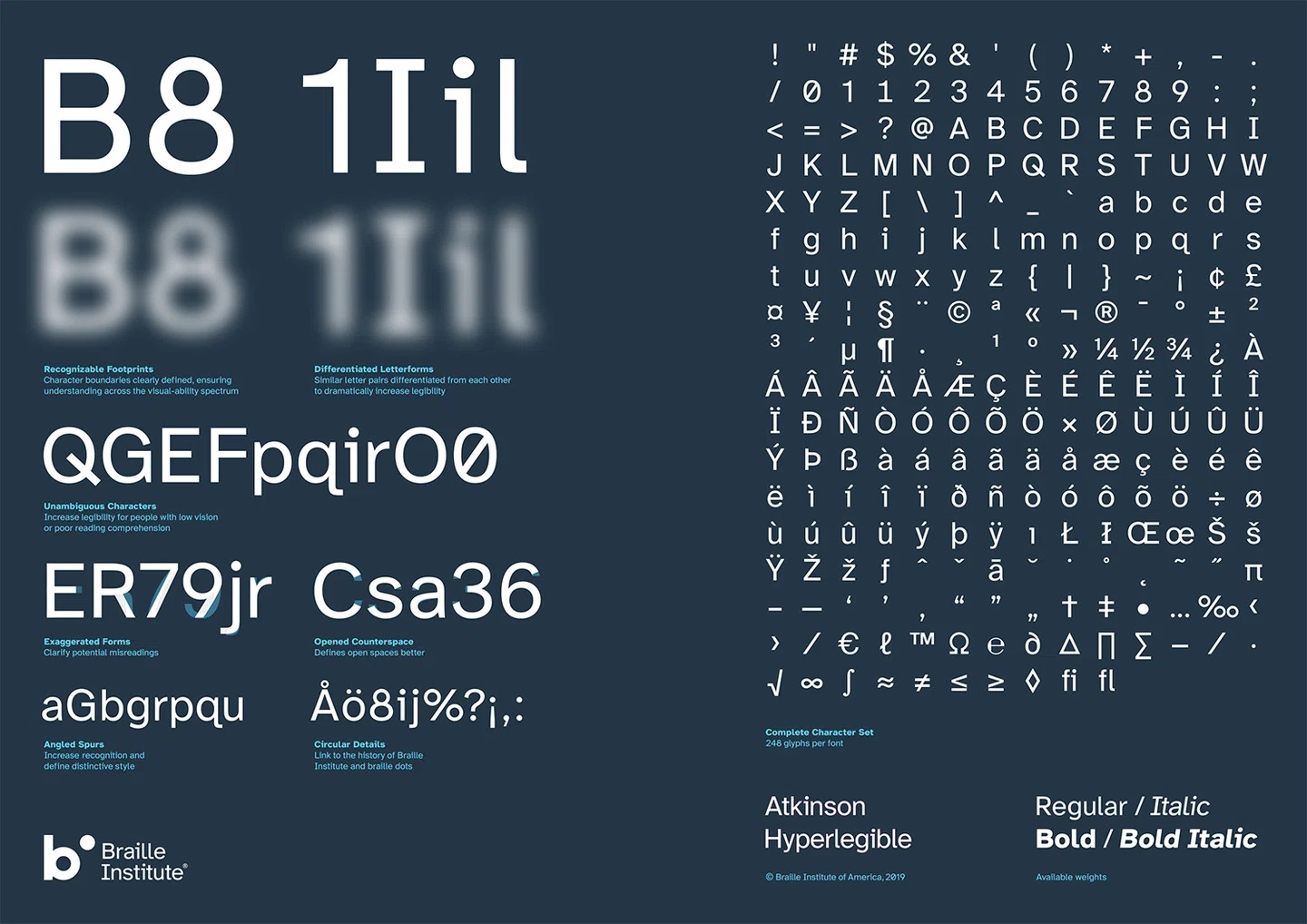
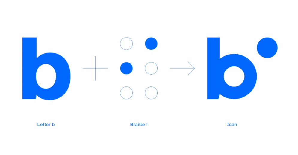
The sans-serif typeface has been named Atkinson Hyperlegible, after J. Robert Atkinson, who founded the Braille Institute and invented Braille machines, and more.
The font was designed to concentrate on letterform distinction – allowing users with low vision to easily differentiate between letters. It includes 992 total glyphs and is available in four weights over 25 languages – helping to be accessible by millions of users.
Why Are Braille Fonts Important?
Visual impairment rates are increasing throughout the world, and are affecting those that do not currently know or want to learn Braille, but who still need support and training to aid them in living independent lives.
Atkinson Hyperlegible font was created to increase character recognition and improve readability whilst users browse the internet and use digital devices.
The new font is available to designers around the world, helping them to create designs for users across the visual-ability spectrum.
You can download the Atkinson Hyperlegible font on Google Fonts here.
This is how the font was created to make it user friendly and readable. Images sourced from Braille Institute.