TL;DR
We refreshed Solsta’s website in line with their new branding, as well as giving the homepage an updated design to increase industry presence and conversions.
Project Overview
Originally Solid State Supplies, Solsta was undergoing a rebrand, meaning their website needed to be updated to be in-line with the new logo, colours and brand elements like iconography and font combinations.
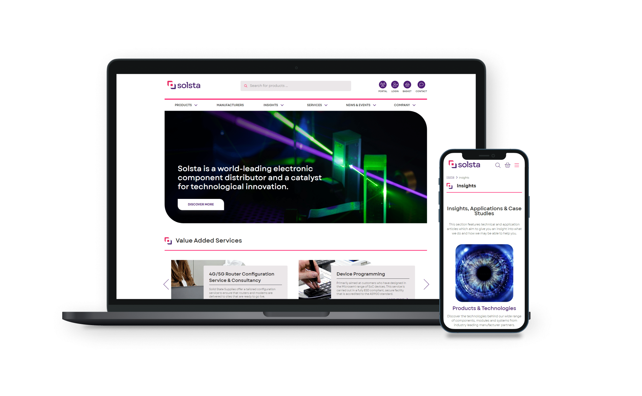
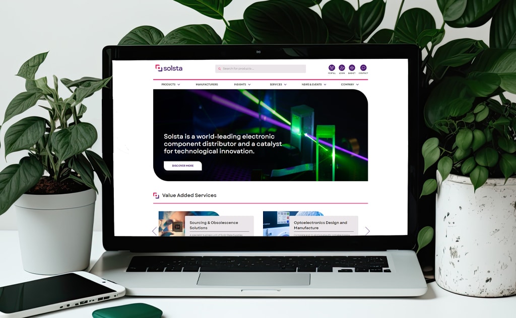
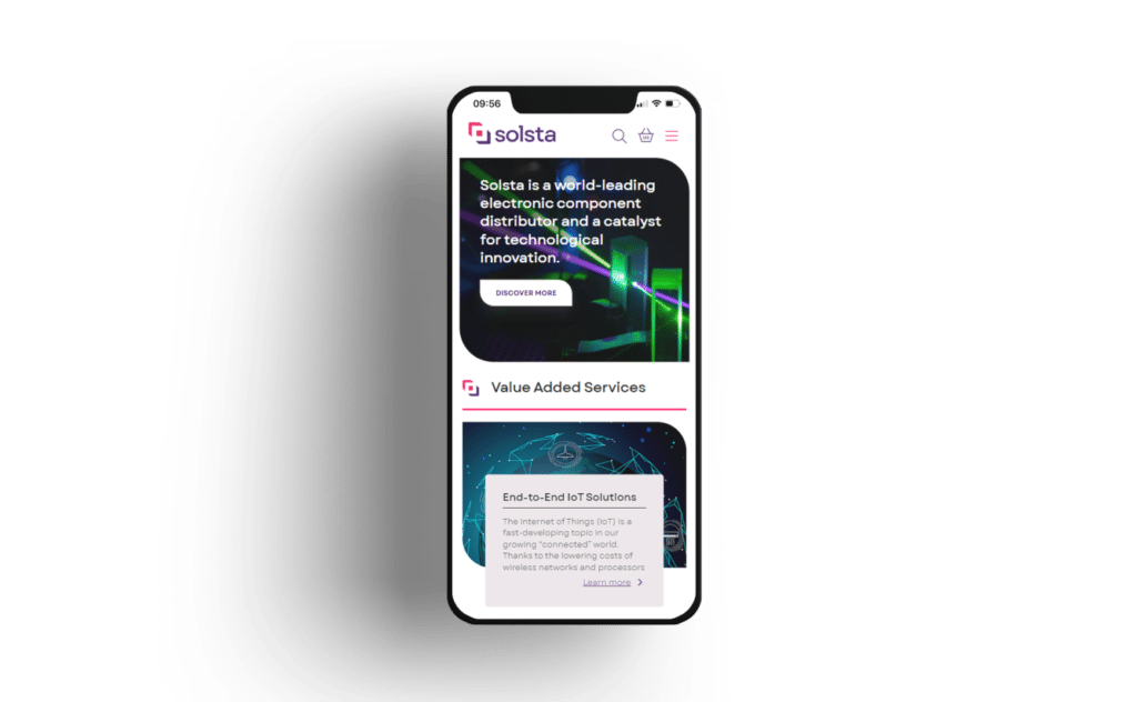
In addition to updating the website with the new brand elements, we also updated the home page design to be more modern and timeless, removing little-used features and adding a new Featured Highlights section, powered by a custom-built WordPress block.
Who are Solsta?
Solsta is a distributor of semiconductors and related components and modules with a keen, in-depth understanding of the products that they sell.
They pride themselves on the quality that they provide, offering outstanding levels of commercial and technical support to their customers.
Solsta is part of the Solid State Group.
Project Brief
Solsta had undergone a brand refresh – complete with a new name, logo and colour palette. While the website needed to be updated to reflect these changes, it was the perfect opportunity to update the design of the site with more contemporary touches too.
Solsta provided full brand guidelines and logo assets following their branding exercise, giving us free rein to propose a refreshed website design while retaining the core structure and functionality of the existing website.
Our Proposal
Collaborating with the client, we proposed:
- Website updated with logo and colours;
- Home page updated with new hero image, sliders and image shapes;
- New footer design in line with industry best practices;
- Universal styling to be updated with branding, for consistency throughout all pages and posts.
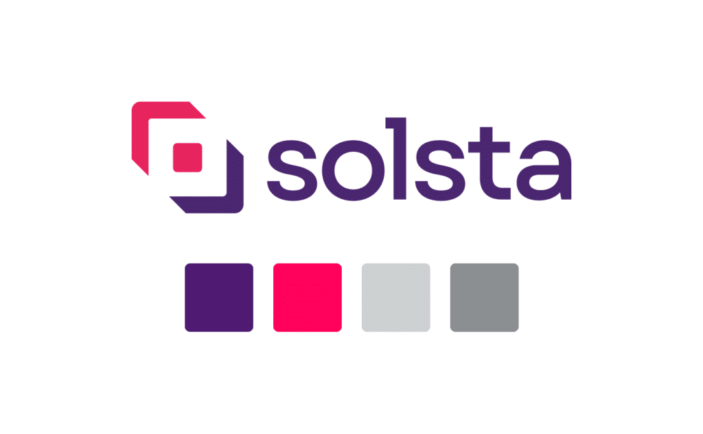
Rebrand Colours
The obvious change that we needed to make to the website was to replace all outdated logos with the new logo, and update the colour palette. The previous red shades have been replaced with vibrant pink and purple – perfect for CTAs and sections to draw user attention.
Special attention was given to accessibility, ensuring all colour combinations achieved acceptable contrast levels for visually impaired users.
Shapes
A leaf shape (AKA a round diagonal corner rectangle) is now a prominent feature of the new Solsta branding, and as such we have incorporated this throughout the website, particularly through images. For example, the new hero image on the home page is now a leaf shape – rather than a traditional rectangle – further helping to assert the branding.
Contact Pop-Up
The original website had a sidebar, where users could complete a form to contact the company. However, the sidebar was a little outdated, and we therefore decided to replace this with a pop-up. This not only frees up valuable screen real-estate but allows users to focus on the task at hand when they decide to make contact.
Users can easily complete a form if they wish to contact the brand, or alternatively they can click the cross icon to remove the pop-up from view. Not only does this help with user experience, but also increases conversions as it encourages users to make contact without distraction.
Distributor Slider
A slider showing all the brands for which Solsta is an official franchised distributor has been improved, now automatically moving after a specified amount of time rather than relying on user interaction (however, users can still click-and-drag or use arrows to move through the slider if they wish). This showcases Solsta’s experience and reputation within their industry.
- #HTML5
- #CSS3
- #WordPress
- #JavaScript
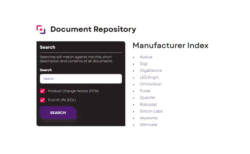
Document Repository
We’ve also incorporated a new custom-developed area of the site where Solsta staff can upload Product Change Notices and End of Life Notices for products they stock.
A simple interface makes this easy to maintain for admins while a search feature for customers lets them quickly find notices that may impact them.
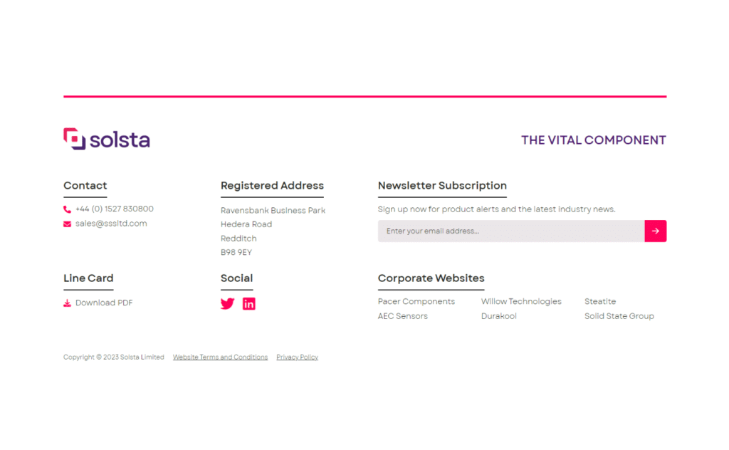
Footer
The website footer has had a major upgrade. Originally, the footer was small, with basic links to point users to various points of the website. This has now been fully redesigned, as a spacious three-column section, showing the logo and main points of contact, along with useful links.
The website footer also now incorporates the company’s newsletter subscription feature, allowing users to convert and sign up for more information.
How We Can Help
For more information or to discuss your own project requirements please get in touch.
Contact us
Send us a quick message and we’ll get right back to you.