Stretchy heading and paragraph blocks are now available in WordPress, allowing you to have better control over how your page or blog post looks. Here’s everything you need to know.
Stretchy Headings and Paragraphs
WordPress 6.9 has introduced ‘Stretchy Headings’ and ‘Stretchy Paragraphs’ – new block types that automatically scale text to fill their container.
WordPress sets the font sizes, shrinking or growing them depending on the content that you add and the size of the given area, allowing users to achieve complex typographic control without the need for CSS.
With text adapting to different device sizes, it creates a consistent look and feel regardless of screen dimensions. Additionally, it ensures that all text is readable and accessible, perfect for the user experience.
Where to Use Stretchy Blocks?
The Stretchy Headings and Stretchy Paragraph blocks are ideal for creating responsive, banner-style typography, perfect for hero sections to create eye-catching headlines. This is ideal for landing pages and portfolios, where unique visual design is important.
The blocks ensure that headings retain their visual prominence and paragraphs remain easily digestible, removing issues like line breaks, excessive white space, or overly small text on mobile devices.
Content Length on Stretchy Paragraphs
It’s worth noting that using large amounts of content in stretchy paragraphs forces the text to appear incredibly small, making it neither readable nor accessible. Therefore, we would advise against using the Stretchy Paragraph block for longer sections of text.
How to Use Stretchy Blocks?
- Ensure your website is updated to the latest WordPress version 6.9
- Add a new block, choosing ‘Stretchy Heading’ or ‘Stretchy Paragraph’.
- Type your text
- Once the page is saved, view it in a new tab, where you’ll be able to see how the blocks look in practice
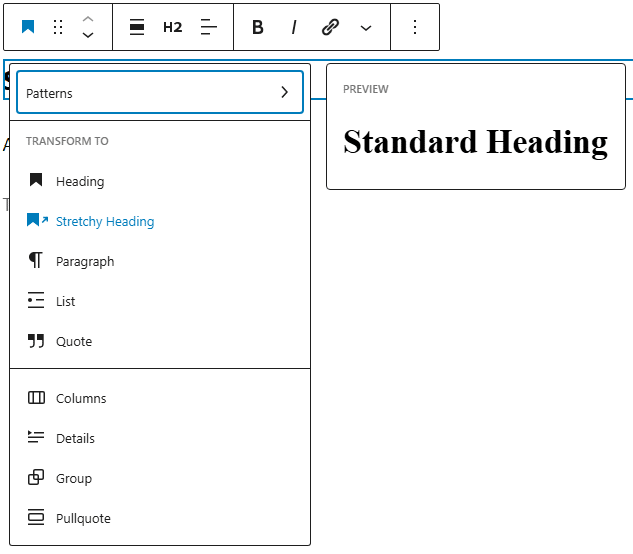
- Alternatively, you can transform an existing standard heading or paragraph to a stretchy version, by selecting the block type icon.
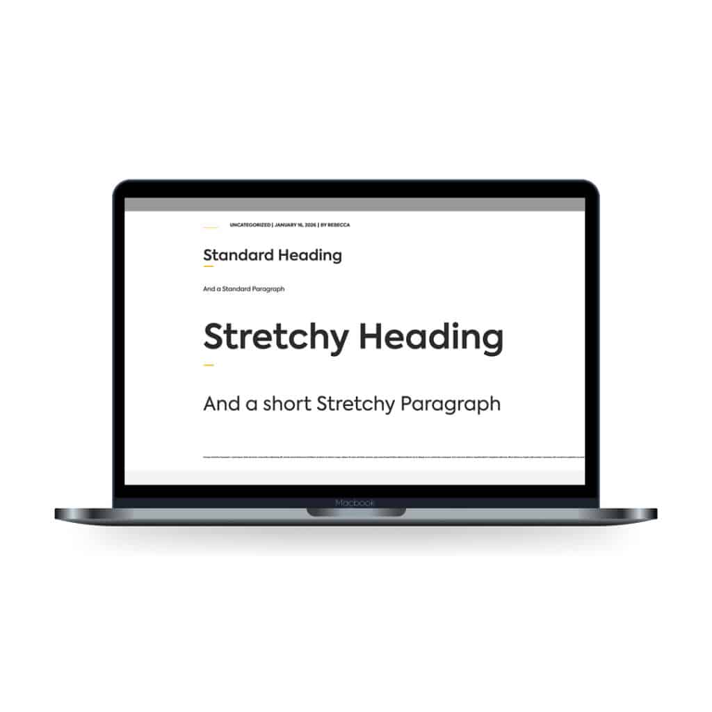
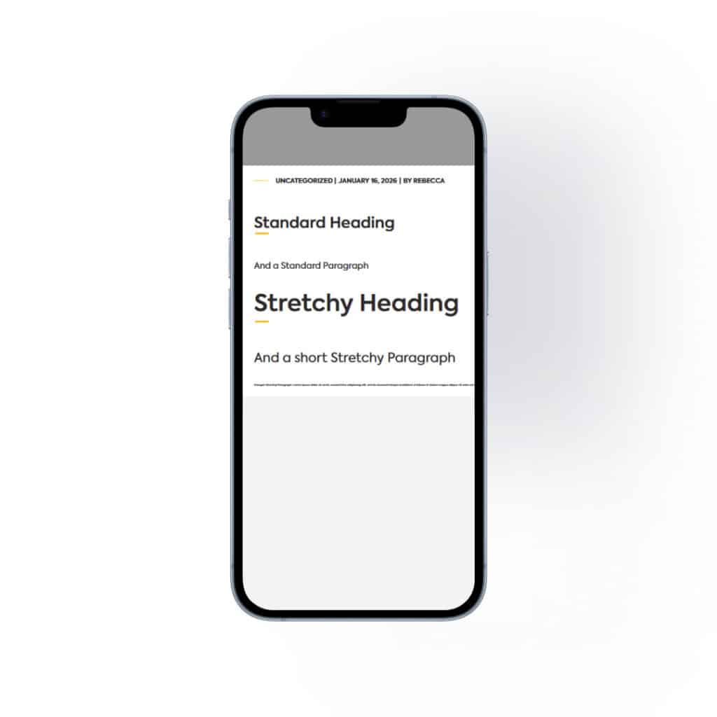
Below is a comparison of how a standard heading and paragraph look compared to a stretchy heading and paragraph block, on the front-end of the Ballyhoo website on both desktop and mobile.
Overview
With the new Stretchy Headings and Stretchy Paragraphs blocks, text resizes dynamically across devices. These innovative blocks change how text behaves across viewing devices, from the largest desktop monitors to the smallest mobile phones, ensuring a professional and legible appearance across all screens.
Is your website mobile responsive? If not, you could be missing out on leads and customers, with 50% of users leaving a site if it is not device-responsive. Ballyhoo can help – we specialise in building successful and appealing websites that offer a seamless experience across all devices. Contact us today for more information – use the form below or drop us an email at [email protected].