Motion Design is a recent web design trend aimed at animating static images, and with visual elements being perceived 60,000 times faster than plain text, it is essential that you include them in your website design.
What is Motion Design & Why Use It?
Motion design is a mix of graphic design, illustration, and 3D technology that allows elements to slide, bounce and respond to touch. Like colour and font choices, motion is visual communication and allows designers to communicate without words.
It is a key aspect of UX design and can help aid brand communication and boost brand awareness, and also helps with brand storytelling.
It is important to remember when using motion design that you need to keep a balance on your website – if you animate every element then it may become overwhelming for the user. Instead, focus on animating those things that you want to draw attention to, or that really matter and help to convert the user.
Where to Use Motion On Your Website
Hover Animation
This is one of the most basic types of animation. When a user hovers over a web layout element such as a button, the design responds with motion to let the user know that it is a clickable element. It is a great way to support easy navigation and to inform website users about the interactivity of elements, and contributes to the overall website design.
What’s more, it adds personality to your brand, giving you a variety of ways to make your website and business stand out from competitors.
Loading Animation
Animated interface details can inform the user of a process, and loading animation is one of the most widely-used types of animated UI. This type of animation informs users at what stage of a process that they are at – offering reassurance to users and makes it a captivating experience. What’s more, this type of motion can make slow loading times less noticeable.
Accent Animation
This animation draws the users attention to details in your layout, such as keywords, phrases, buttons, menus or directional cues. It allows users to scan the content for the most relevant information, and makes navigation easier. For example, accent animations may highlight key benefits (such as free postage on an e-commerce website), or be used to make CTAs and buttons more visible.
Interactive Animation
This type of motion aims to engage the user to engage with the website. It can provide users with feedback on their actions, such as showing users models of a product, interactive map elements, or menu pages.
Examples of Website Motion Design
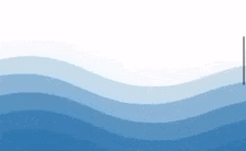
Mercia Marine
Of course, we have to include this example that our very own team member Sam included on our Mercia Marine project. As mobile users scroll down the home page and tap the wave separator, a small dolphin appears jumping out of the water! This easter egg motion is a great way to encourage users to engage with the website, adds flair to the business brand, and rewards users for performing an action.
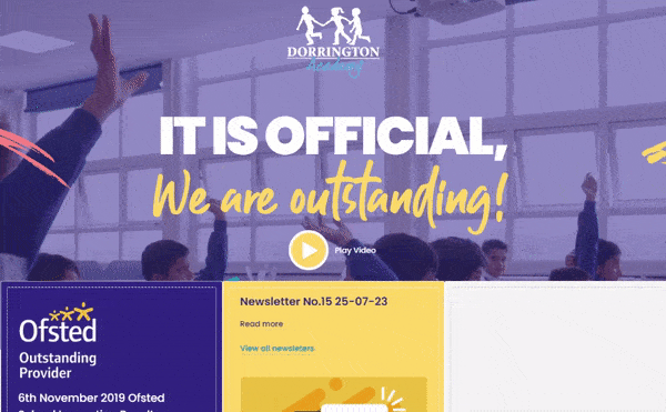
Dorrington Academy
Dorrington Academy uses a popular motion type called background motion. You’ll notice this element at the top of the home page, where a video plays behind the other elements on the page. This gives the user visual information about the school, and helps to give an insight into who they are and what they do. It also makes the website look modern and fresh.
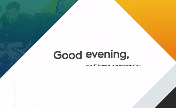
Ballyhoo
You may have noticed that we have animation on our own website – namely on our homepage which says ‘Good morning’, ‘Good afternoon’ or ‘Good evening’ depending on the time of day that you land on our website.
View our website homepage here
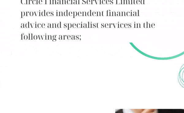
Circle Financial
As the Circle Financial website is based on minimalist design, we focused heavily on motion to highlight key elements. This is implemented through pure CSS to keep the website lightweight and reduce page speed, and using scroll animation helps to keep users engaged.
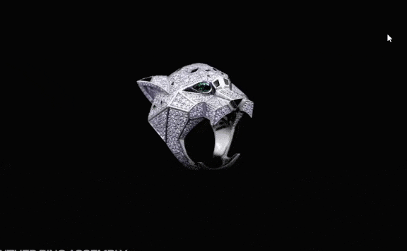
Ore
Ore is a design brand that creates premium quality diamond jewellery and offers customisation. They use animation when showing their products – users scroll over individual product images which then grow or rotate, further showing the user more of the product and encouraging them to click through.
Handywrytten
Handywrytten is an online handwritten notes service. Their website uses innovative motion on its illustrations. We love scrolling on the homepage to see the pen scroll with you, highlighting the title ‘We Write’. Not only is this great for user experience as the motion follows your eyes, but it also highlights important information for ease of reading for the user.

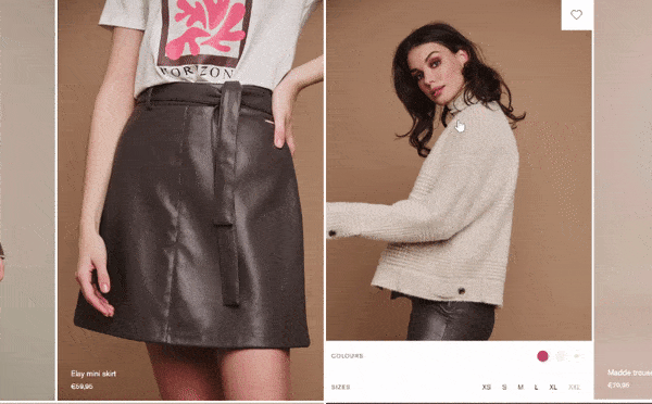
Rino & Pelle
Rino & Pelle is a retail company that specialises in luxury womenswear. When hovering over their product images, alternative product images are shown – such as flatlays or the product shown from a different angle. This allows users to see the product itself, and encourages them to click through.
A Word From Us
Motion design is a great way to increase session length, as visitors will enjoy the attractive user experience and will stay browsing for a longer period of time. In turn, this boosts user engagement and retention, and may encourage them to convert into a customer.
Want to incorporate motion design into your website or app development project? Our team at Ballyhoo can create attractive and user friendly websites that will help users to convert. Contact us today to tell us about your project and let’s get it in motion (no pun intended!).