Trends in the world of web design are always changing; some get more complicated while others take more of a simplistic approach. So far this year, we have seen many new trends and unique ideas and thought it would only be right to compile a list of our favourite trends to keep you up-to-date.
Typography
Typography is simply the words you see on a page, how it appears and which style of text has been chosen. The typeface you choose and how well it works with your colour scheme, grid, design theme and layout will help determine whether it is an excellent or poor design. There are two main styles of typography we have been seeing very often, big and bold, and contrast.
Big and Bold
Currently big and bold typography is all the rage amongst web designers as it helps to break up a page nicely. Not only does this attract the reader’s eye, but it also holds their attention.
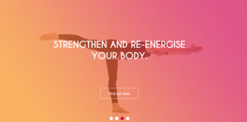
Big and bold doesn’t necessarily refer to the weight of the font; it’s more about dedicating space to just a single word or statement and making it the primary focus.
Contrast
Something else favoured among web designers is creating contrast within their typography. The most popular way we’ve seen this implemented is by using a range of contrasting typefaces, with Geometric, Serif and Monospaced fonts being common choices. Designers have also been seen to contrast the colour and size of their fonts to enhance the look and feel of their websites.
Minimalism
With web designers increasingly on the hunt to find new ways to make typography their principal focus, they have started to adopt a more minimalistic approach by using basic monochrome colours or condensing their content, so fewer words are on each page. Some designers even take this approach to the next level, with pages displaying a single sentence or word placed over an image.
Card Design
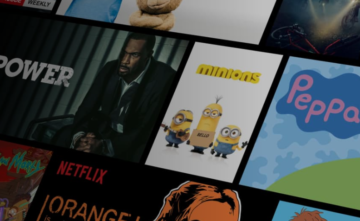
Card design is an approach that started with Pinterest; it involves making images the focus of the entire page to give users all the information they need to know. Sites like Netflix and Spotify have now adopted this approach, displaying screen grabs from films or images of album covers; the thumbnails can sometimes do more talking than a short bio could, and, because of this, it is set to be a big trend this year.
Authentic Photography
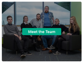
More and more websites are using their own unique images relating to the brand over stock photography and graphics. This makes the site a lot more personal, and some websites even incorporate “Meet The Team” photographs to help put a face behind the name.
While professional photography isn’t going to blow the bank, with tools like Instagram and the hardware on smartphones becoming ever more sophisticated, it’s becoming easier than ever to take and edit stunning photographs in-house to communicate brand values and demonstrate products and services in action.
Colour
Vibrant Colours
As websites get more minimalistic, web designers need to come up with new ways to keep their appearance attractive without looking too busy. Using brighter colours and patterns that compliment one another across the website adds depth and texture to layouts, while still keeping it straightforward and minimal.
Duotone
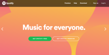
A duotone image is an image made up of just two colours, websites like Spotify’s have been seen sporting this trend as it keeps their website minimal and adds interest. We hope to see more sites use this approach to determine whether it has been a success or not.
If you’d like any further information on web design trends, feel free to contact Ballyhoo today on 0121 295 5352, email to [email protected] or by filling out the enquiry form on our contact page.