The images you have on your website influence both the customer journey and the purchasing decision, so product photography is likely to be at the heart of your e-commerce website.
Effective photos set the first impression of your brand, allowing customers to connect with your brand and products, find out more about your products, and increase sales.
What’s more, as humans we now have a shorter attention span than ever before – approximately 8 seconds – meaning we often just skim product pages. Our eyes, however, are more drawn to images than words – in fact we process visual images 60,000 times faster than text – showing how important visual cues are on your website.
Below, we explore the characteristics of bad and good e-commerce photography, with brand examples and what you can learn from them.
E-commerce Product Photography Don’ts
Bad product photography includes:
- Low resolution images
- Distracting props
- Disproportionate objects
- Distorted colours or over-exposure
If you do not showcase your product accurately with photos – for example if you do not show the correct colours or use disproportionate objects in the lifestyle layout – customers will get the wrong impression and be misled, resulting in them being unhappy, and your reputation potentially being harmed.
Here are some brands that have gotten it wrong, so that you can see how not to do it.
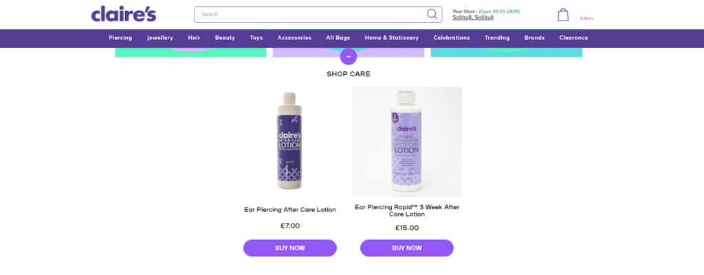
Claire’s
Scrolling to the bottom of a product page, Claire’s has an up-sell section, but this is where the error lies. Both product images have issues:
- They are from different angles
- One has transparent background, the other does not
- Reflection and glare on both products’ packaging labels
These issues make the product photography feel amateur, and doesn’t effectively sell the products to customers.
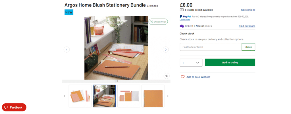
Argos
When uploading your photos and editing them, it’s important to think about the format you want them in.
Argos have some impressive images, but they are all different shapes and sizes – some are rectangular and some square. This inconsistency when navigating through their product image sliders makes the website look messy.
As a mass merchant website, Argos will often use images provided by manufacturers but their e-commerce team should be on top of achieving image ratio consistency, and there’s really no excuse when it comes to their own-brand products!
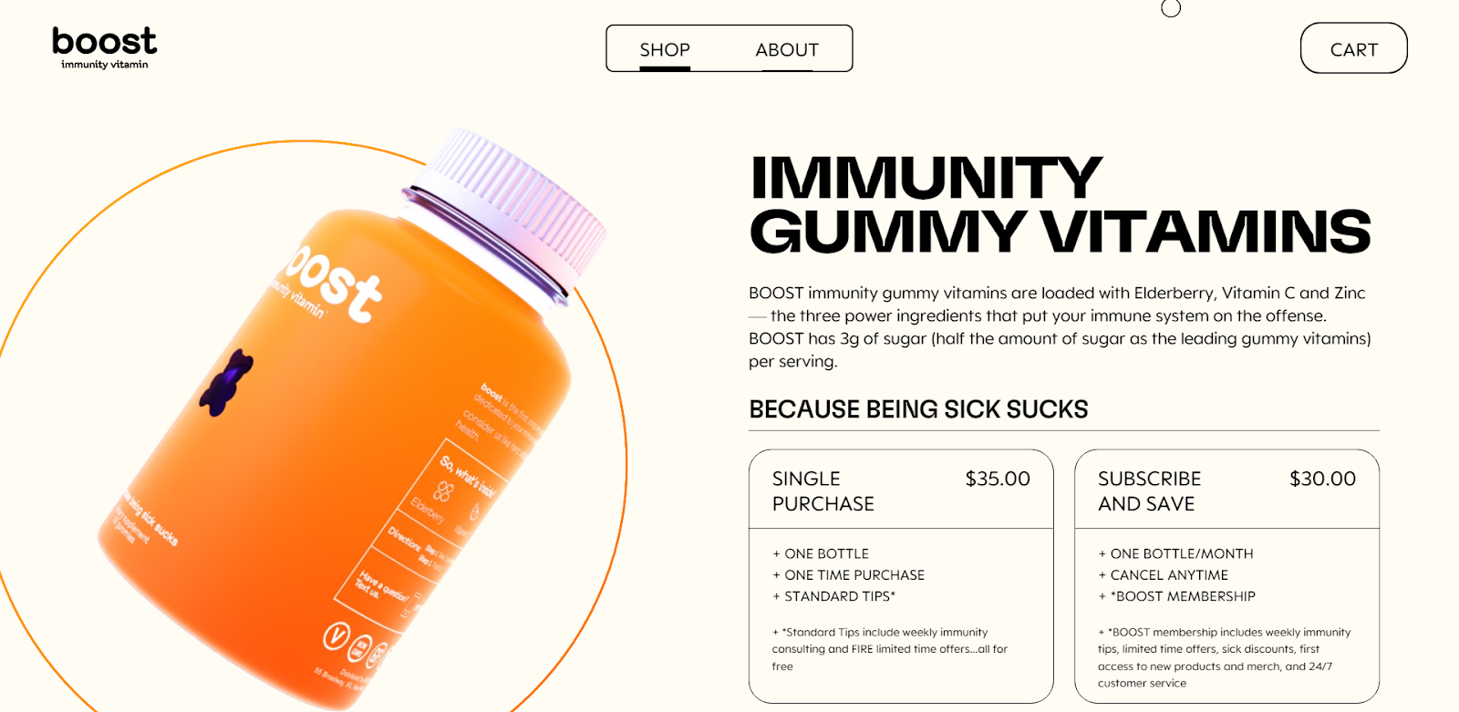
Boost
This might be more of a website design issue than a product photography one – but it’s still worth mentioning.
On Boost’s product page, you are immediately greeted with a crisp looking photo, but (and there’s a big but) the only way for users to view the full product photo is by scrolling – at which point you’re too far down the page to see the front of the product/gummy box.
This is frustrating for a user as it means they are unable to view the product properly – and without being able to see exactly what it looks like, they are less likely to purchase.
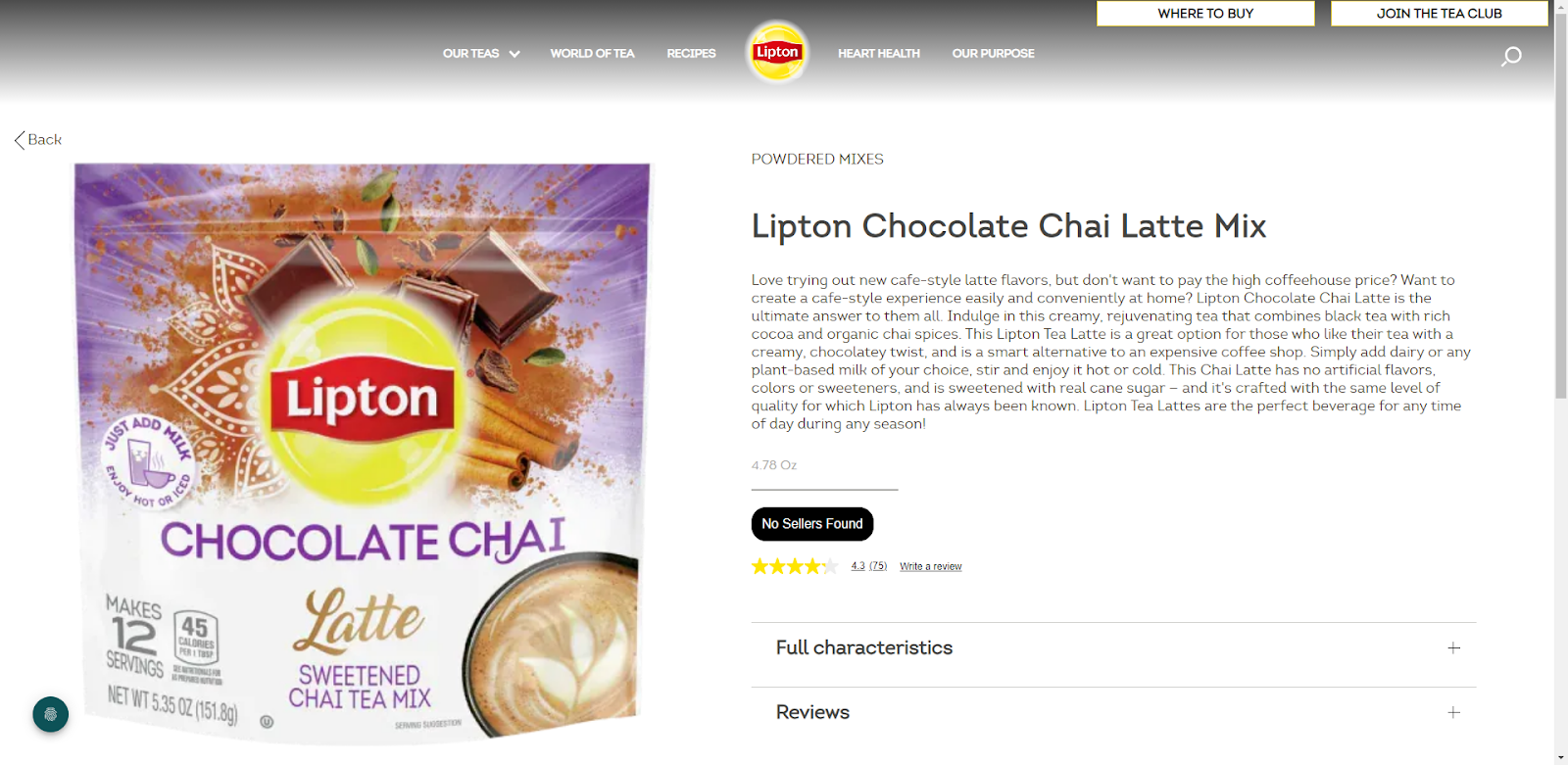
Lipton Teas
Lipton is known worldwide, and you’d think their photos would be up-to-scratch, but their product pages say otherwise. The images are being stretched, resulting in them appearing pixelated.
If your website design is similar to Lipton’s – with the screen split evenly – remember that you’ll need to have large, high-resolution images to ensure they are not stretched beyond their original size on larger screens.
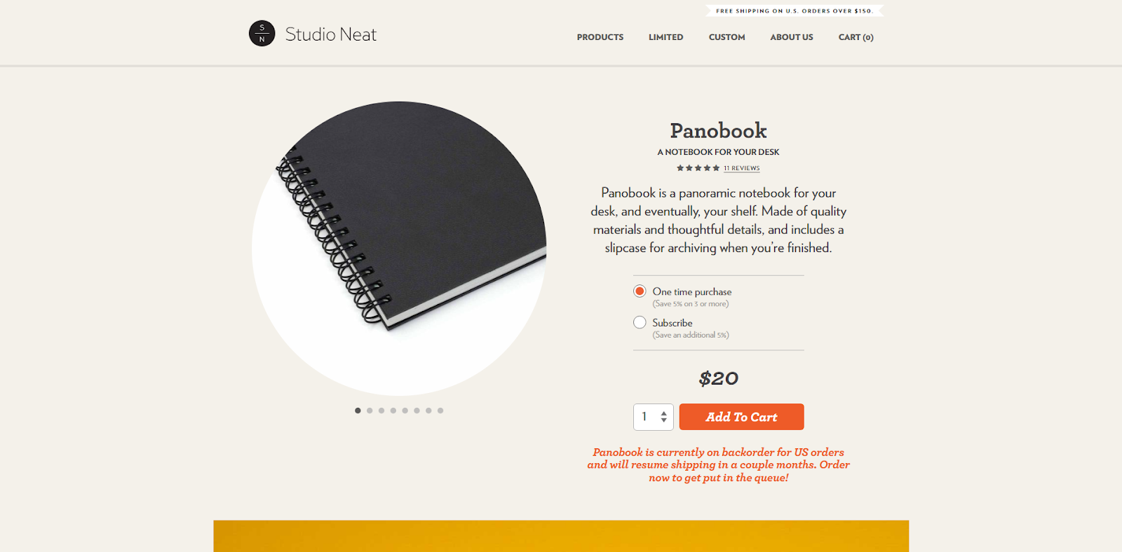
Studio Neat
Although the Panobook product page showcases the different angles of the product, we can’t help feeling like we can’t see the product properly. The small, rounded images mean that the full product is being cut off, and instead only shows you close up images.
E-commerce Product Photography Do’s
Now that we’ve looked at what you shouldn’t be doing with your product photography, we can start to look at what you should be doing. Below are examples of good product photography case studies, along with a checklist of tips to live by.
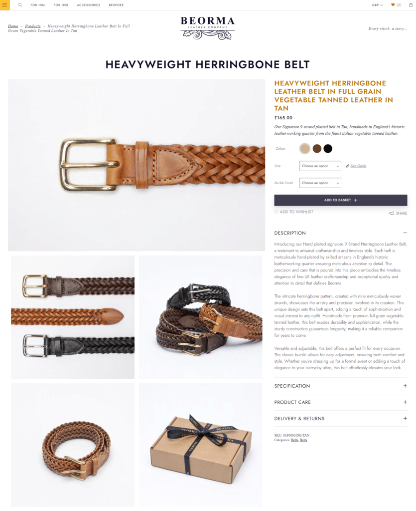
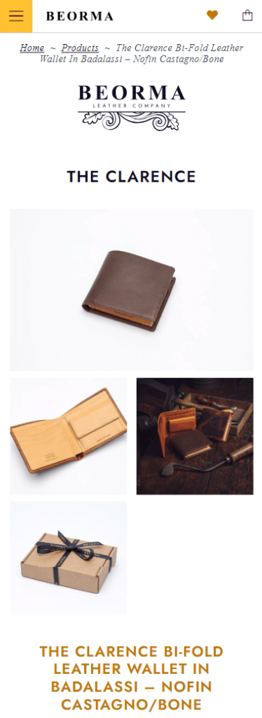
Beorma Leather Company
Beorma Leather Company’s high quality photos utilise consistent angles and lighting, to make user navigation easy. In addition to e-commerce images, the website also showcases lifestyle images of products in real-life scenarios, helping the customer to visualise how they can use the product once purchased.
Along with creating the Beorma Leather Company website, we accompanied one of our trusted photographers to get hundreds of e-commerce and lifestyle flatlay shots, providing artistic direction.
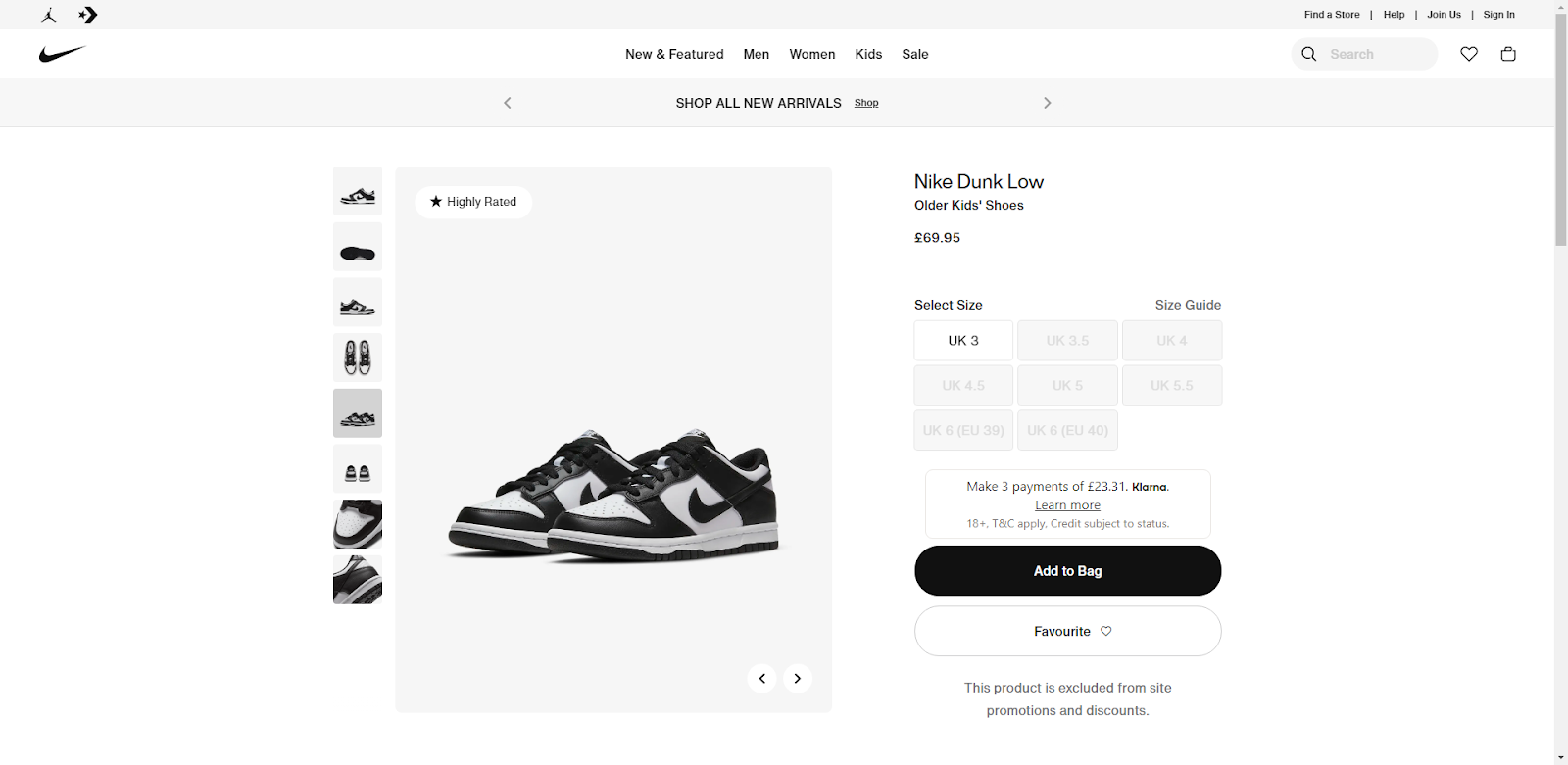
Nike
Nike does a really good job of showcasing their products from every angle, using consistent lighting and background colour for each image. This means that the customer can get an almost 360° view of the product – imitating being able to hold it physically in your hand.
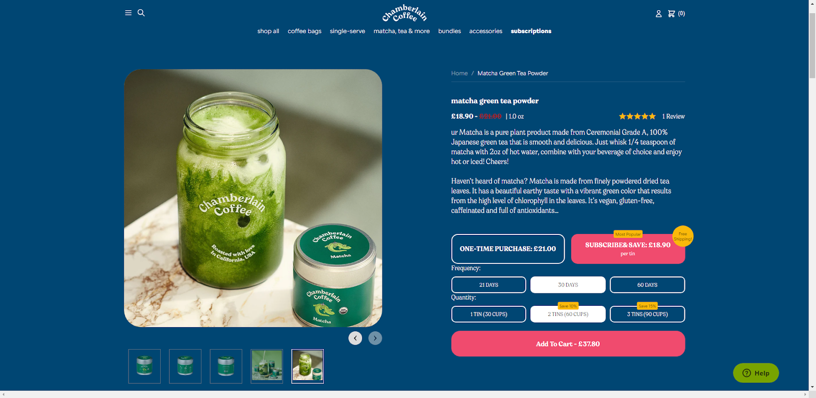
Chamberlain Coffee
A great example of showing the product, along with its benefits.
If you’re selling an ingredient or supply to make something else, be sure to show how it can be used in everyday life, or with the finished product. For example, if you’re selling luxury coffee beans, include an image of the beans next to a freshly brewed cup of coffee.
Lifestyle shots like these are great for inspiring users and encouraging them to imagine what their life could look like (and how much better it will be) once they’ve purchased your product.
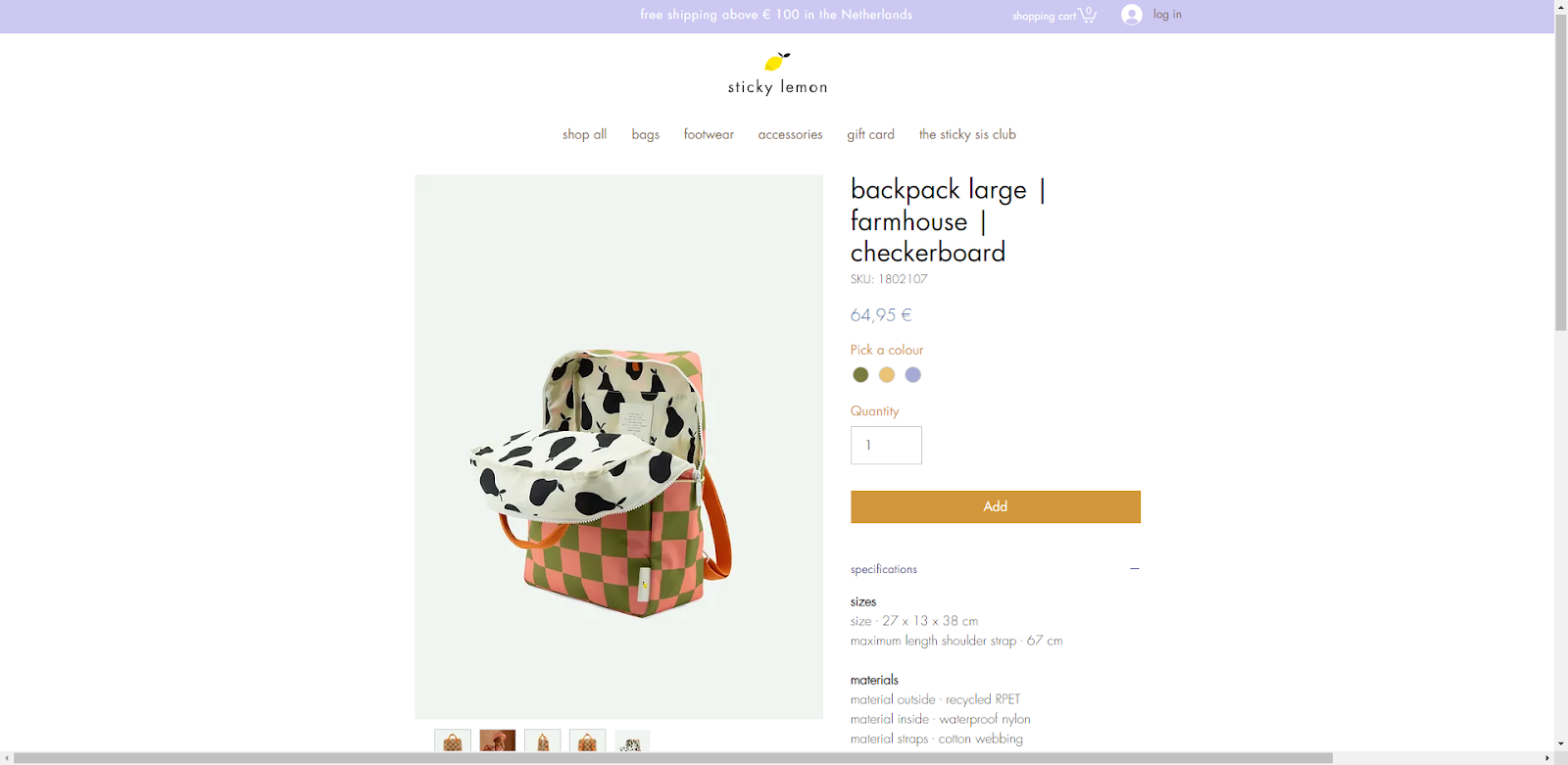
Sticky Lemon
We are a big fan of the Sticky Lemon website, including the product images. Images show multiple angles of the products, along with colour options and variations. Images focus on the unique selling points (USPs) – for example, the inner compartments of their backpacks. Although these USPs are written in the product description, users may just glance over images rather than reading, so it’s good to cover all bases and show them visually too.
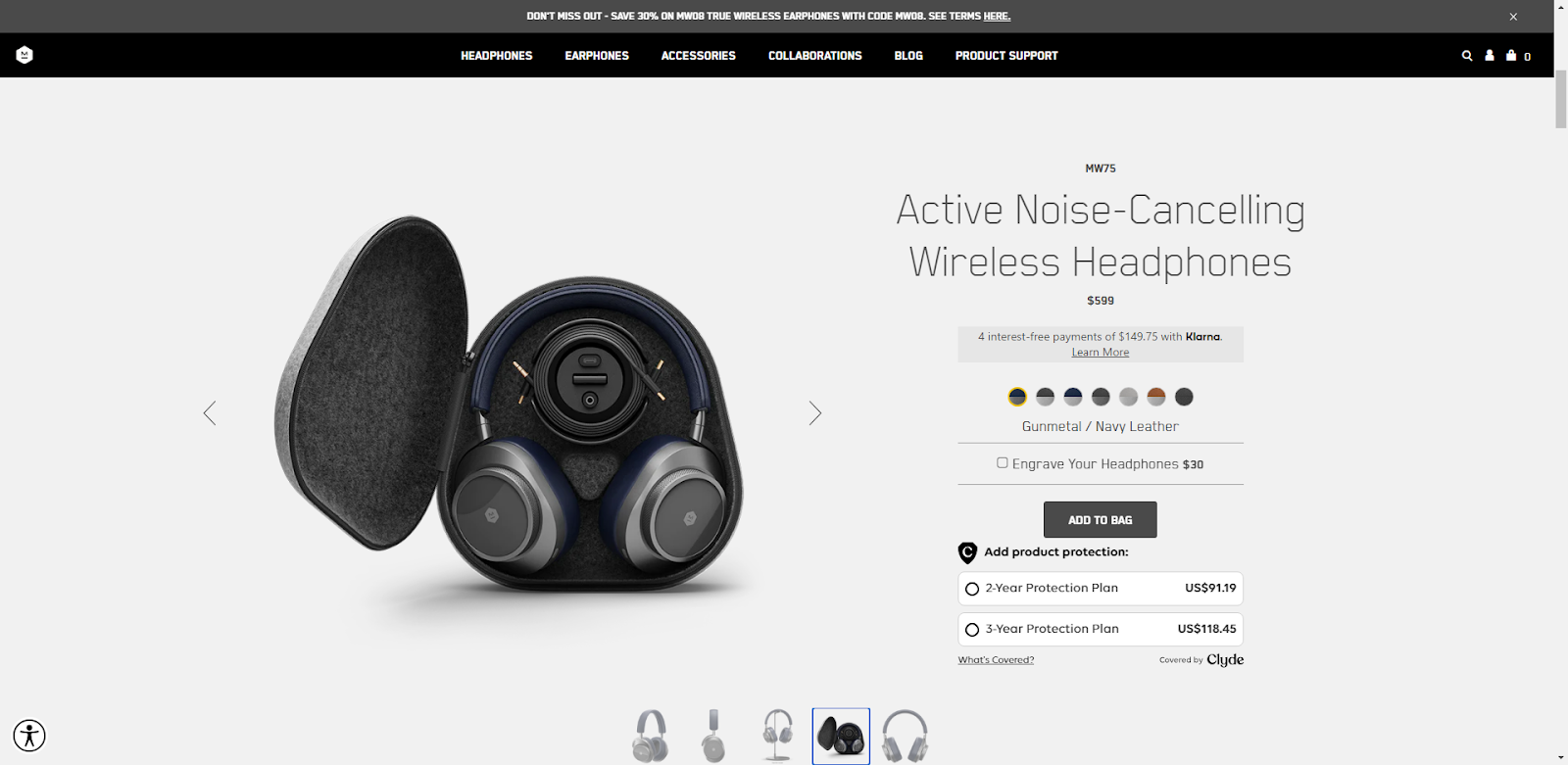
Master & Dynamic
We’re really impressed with the Master & Dynamic website images – they’re clean, crisp and great quality. Images also show how the products arrive and how users can keep them safe and secure in everyday life – clearly demonstrating to users the benefits of having the products in their life.
Website Product Photography Tips
When showcasing your product photography on your e-commerce website, it’s important to keep in mind these following tips:
- Use consistent lighting and angles for each product and variant
- If possible always hire the same photographer or studio
- Use front and central placement to highlight the product
- Use a fresh, white background or another neutral shade
- Showcase product features and USPs
- For lifestyle images, create a story
- Show people using the product
User Generated Content
As well as showcasing your e-commerce and product photography, you can also include customer images on product pages. Utilising User Generated Content allows your website visitors to see how real life customers have used your products in their life, and helps them to visualise how they can incorporate the product into their daily lives.
E-commerce Website Design
It’s worth noting that you could have the best photographs in the world, but without a good website, they are pointless. Therefore, it’s important to invest in your website. Need help? Here at Ballyhoo we are e-commerce website design and development specialists with over 50 years combined experience. Call or email us now for a free consultation to discuss your requirements to get your website up and running and growing in no time.