Index
- Logo
- Colours
- Gradient
- Fonts
- 8 Column Block
- Media & Text
- Columns
- Headings
- Lists
- Tables
- Pullquote
- Featured Services
- Latest News
- Featured Projects
- Team Members
- Organisations Grid
- Latest Posts
- Portfolio Linear Background Section
- Portfolio Content Overview Section
- Portfolio Languages Section
Branding
Logo
Our primary logo is black on white but the reverse can be used on dark backgrounds. The logomark is the last Ballyhoo ‘O’ and leaves.
Colours
Ballyhoo’s brand colours should be used to add punch to our mainly monochrome colour scheme. Keep contrast in mind when choosing colour combinations.
Blue
053B6D
Forest Green
04735F
Yellow Cab
FCB515
Burnt Orange
F16E0B
Black
2D2A2B
A5ACAD
Cool Grey
DEE5E7
F4F3F4
Gradient

Fonts
Axiforma
Playfair Display
Layout
Use the following blocks to create an attractive page layout. Basic paragraphs (like this one) should be interspersed with these blocks to create visual interest and draw attention to important content.
Eight Column Block(Linear Background)
An eight column block uses the central eight columns of the grid and is narrower than typical content. It is used for page introduction copy and for important points of interest.
This block uses the option Linear Background to show our Ballyhoo brand gradient and should be reserved for copy we really want to draw attention to. The text has been aligned using Align Content Centre and Has CTA has also been selected to add a button with a link.
Eight Column Block
This eight column block can be used more regularly and uses the default styles for this block (plain background, aligned left). A CTA has been added and selected as “dark” to provide contrast.
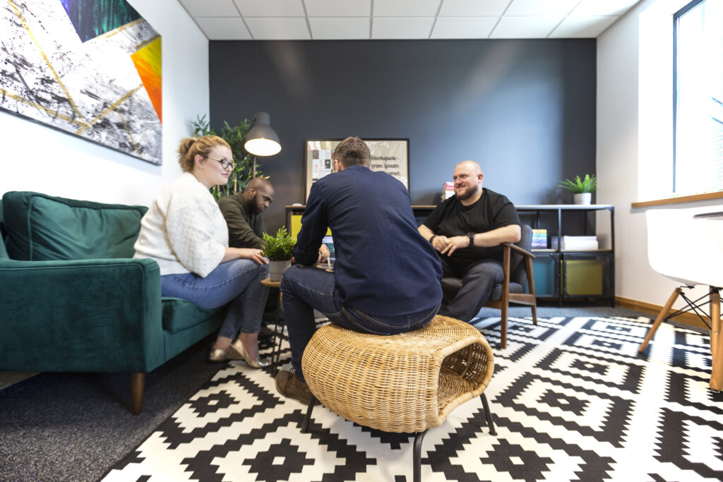
Media & Text (Left)
This block is preferred for showing images rather than inserting an image within the content.
The background and text colours are customisable and the image can be aligned left or right. The columns will stack on smaller resolutions.
Lorem ipsum dolor sit amet, consectetur adipiscing elit. Maecenas molestie, nisl eget lobortis iaculis, nulla urna iaculis elit, non tristique metus ex id sapien. Maecenas vel dictum mauris. Vivamus dictum mattis erat non sollicitudin. Aenean euismod porttitor interdum. Integer consequat consequat dolor, vel vestibulum nunc dictum sit amet. Donec justo enim, auctor ut lacinia eget, bibendum a nisi.
Media & Text (Right)
Lorem ipsum dolor sit amet, consectetur adipiscing elit. Maecenas molestie, nisl eget lobortis iaculis, nulla urna iaculis elit, non tristique metus ex id sapien. Maecenas vel dictum mauris. Vivamus dictum mattis erat non sollicitudin. Aenean euismod porttitor interdum. Integer consequat consequat dolor, vel vestibulum nunc dictum sit amet. Donec justo enim, auctor ut lacinia eget, bibendum a nisi.
Column 1
Lorem ipsum dolor sit amet, consectetur adipiscing elit. Maecenas molestie, nisl eget lobortis iaculis, nulla urna iaculis elit, non tristique metus ex id sapien. Maecenas vel dictum mauris. Vivamus dictum mattis erat non sollicitudin. Aenean euismod porttitor interdum. Integer consequat consequat dolor, vel vestibulum nunc dictum sit amet. Donec justo enim, auctor ut lacinia eget, bibendum a nisi.
Column 2
Lorem ipsum dolor sit amet, consectetur adipiscing elit. Maecenas molestie, nisl eget lobortis iaculis, nulla urna iaculis elit, non tristique metus ex id sapien. Maecenas vel dictum mauris. Vivamus dictum mattis erat non sollicitudin. Aenean euismod porttitor interdum. Integer consequat consequat dolor, vel vestibulum nunc dictum sit amet. Donec justo enim, auctor ut lacinia eget, bibendum a nisi.
Column A
Lorem ipsum dolor sit amet, consectetur adipiscing elit. Maecenas molestie, nisl eget lobortis iaculis, nulla urna iaculis elit, non tristique metus ex id sapien. Maecenas vel dictum mauris. Vivamus dictum mattis erat non sollicitudin. Aenean euismod porttitor interdum. Integer consequat consequat dolor, vel vestibulum nunc dictum sit amet. Donec justo enim, auctor ut lacinia eget, bibendum a nisi.
Column B
Lorem ipsum dolor sit amet, consectetur adipiscing elit. Maecenas molestie, nisl eget lobortis iaculis, nulla urna iaculis elit, non tristique metus ex id sapien. Maecenas vel dictum mauris. Vivamus dictum mattis erat non sollicitudin. Aenean euismod porttitor interdum. Integer consequat consequat dolor, vel vestibulum nunc dictum sit amet. Donec justo enim, auctor ut lacinia eget, bibendum a nisi.
Column C
Lorem ipsum dolor sit amet, consectetur adipiscing elit. Maecenas molestie, nisl eget lobortis iaculis, nulla urna iaculis elit, non tristique metus ex id sapien. Maecenas vel dictum mauris. Vivamus dictum mattis erat non sollicitudin. Aenean euismod porttitor interdum. Integer consequat consequat dolor, vel vestibulum nunc dictum sit amet. Donec justo enim, auctor ut lacinia eget, bibendum a nisi.
Page Copy
Everything you need to format beautiful page copy.
Heading 2
Heading 3
Heading 4
This is a paragraph.
Lorem ipsum dolor sit amet, consectetur adipiscing elit. Maecenas molestie, nisl eget lobortis iaculis, nulla urna iaculis elit, non tristique metus ex id sapien. Maecenas vel dictum mauris. Vivamus dictum mattis erat non sollicitudin.
Lists
Add a class of “alpha” to change an ordered list from numerical to alphabetical.
Unordered List
- Lorem ipsum dolor sit amet, consectetur adipiscing elit.
- Maecenas molestie, nisl eget lobortis iaculis, nulla urna iaculis elit, non tristique metus ex id sapien.
- Maecenas vel dictum mauris. Vivamus dictum mattis erat non sollicitudin.
- Aenean euismod porttitor interdum. Integer consequat consequat dolor, vel vestibulum nunc dictum sit amet.
- Donec justo enim, auctor ut lacinia eget, bibendum a nisi.
Ordered List
- Lorem ipsum dolor sit amet, consectetur adipiscing elit.
- Maecenas molestie, nisl eget lobortis iaculis, nulla urna iaculis elit, non tristique metus ex id sapien.
- Maecenas vel dictum mauris. Vivamus dictum mattis erat non sollicitudin.
- Aenean euismod porttitor interdum. Integer consequat consequat dolor, vel vestibulum nunc dictum sit amet.
- Donec justo enim, auctor ut lacinia eget, bibendum a nisi.
Ordered List (Alpha)
- Lorem ipsum dolor sit amet, consectetur adipiscing elit.
- Maecenas molestie, nisl eget lobortis iaculis, nulla urna iaculis elit, non tristique metus ex id sapien.
- Maecenas vel dictum mauris. Vivamus dictum mattis erat non sollicitudin.
- Aenean euismod porttitor interdum. Integer consequat consequat dolor, vel vestibulum nunc dictum sit amet.
- Donec justo enim, auctor ut lacinia eget, bibendum a nisi.
Table
Tables are used to communicate data and present information, such as feature comparisons.
| Header One | Header Two | Header Three | Header Four | Header Five |
|---|---|---|---|---|
| Row 1 | Cell | Cell | Cell | Cell |
| Row 2 | Cell | Cell | Cell | Cell |
| Row 3 | Cell | Cell | Cell | Cell |
Pullquote
Use a pullquote to draw attention to a specific part of the page copy or to include remarks from a team member or client.
Use class=”has-quote” to add an optional speech mark to the background.
This is the Solid Colour pullquote set to Full Width. The main and text colours are fully editable.
Optional Attribution
Custom Blocks
Advanced custom blocks are unique to this website. These are available to use throughout the website but have usually been created for a specific section of the site, for example portfolio case studies.
3 Featured Services
On the homepage this block displays three featured services. On any other page 3 random services are shown.
A short introductory paragraph (an editable Excerpt) about the service appears on hover.
Special classes: Use “align-full” to make full-width.
All Services Grid
All service pages are output here. This is mainly for the Services top level page.
Featured Projects
Displays two sets of random featured projects from our portfolio. These transition in row-by-row when scrolling down the page.
On hover these display the Excerpt which has been added to the portfolio item. This is usually the same as the subheading added to the item.
Special classes: Use “align-full” to make full-width.
Team Members
Team members can be added to the system with a headshot and biography. Members can be selected in unlimited configurations and output using this advanced custom block.
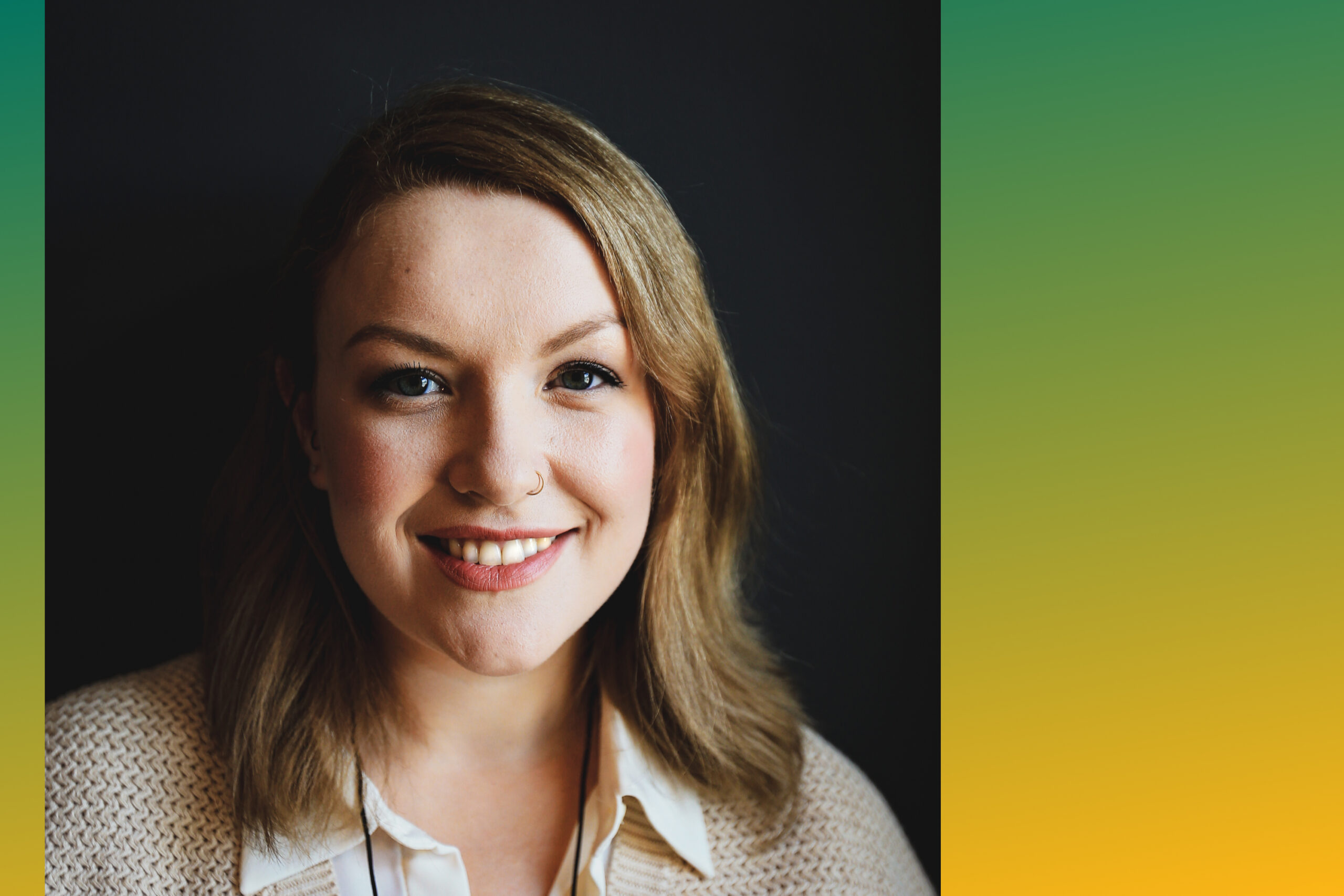
Alison Chaffey
Creative Director
Alison is our Creative Director*. She has worked alongside Anthony to build the business since it was founded in 2009. Her passion is design and UX, and she has a laser eye-for-detail. In other words, she’s a web developer’s worst nightmare.
*In reality, Alison’s role encompasses too many tasks to mention; in essence, she keeps Ballyhoo running smoothly and moving forwards.

Anthony Chaffey
Managing Director
Anthony’s role is to manage your project and get the most out of his team. More likely than not, Anthony will meet with you and be your main contact during your time with Ballyhoo.
Anthony’s vast experience is vital to the success of the projects we take on. He has a holistic approach to working with clients and looks at what is best long-term for your business when recommending which approach to adopt.

Sam Bispham
Online Marketing Manager
Sam manages online marketing strategies for our clients, working to identify areas for improvement and helping you to make the most of your website. His knowledge and skills can help you turn an online presence into an online success.
Sam is always ready to lend a helping hand to anyone and, as part of the management team, he is a key voice when considering company strategy and implementation.
Organisations Grid
This block shows a selection of logos of companies we have worked with. Clicking on the logo takes the user to view the respective case study in our portfolio.


Latest Posts
Shows the latest three posts from the Ballyhoo blog.
Portfolio Linear Background Section
This section is primarily for the TLDR (too long didn’t read) summary at the top of a portfolio item. The heading is offset to the left to save space and differentiate from other blocks.
Portfolio Content Overview Section
This section is for the main content on a portfolio page, giving an overview of the project and the parameters.
A custom background colour can be selected and a Bg Pattern can also be optionally selected which appears down the right side of the block to add visual interest.
Content within this block needs to be added with HTML formatting.
Lorem ipsum dolor sit amet, consectetur adipiscing elit. Maecenas nunc nisl, fringilla in purus sed, rutrum hendrerit felis. Aenean aliquam ligula nec erat ultricies, at bibendum justo malesuada. Nam a justo luctus, convallis orci et, feugiat eros. Quisque vitae nisi at est maximus semper. Cras at congue tortor. Donec sed dignissim libero, vitae dictum urna. Praesent quis lacus scelerisque, aliquam mi sed, viverra magna. Proin quis eros faucibus, laoreet leo vitae, efficitur purus. Nam at viverra ligula. Phasellus id velit tincidunt tellus congue auctor a dictum lectus. Donec consequat arcu est, et lobortis orci mollis at.
Duis at dolor felis. Quisque vel gravida tellus. Praesent vel odio magna. Integer eu mollis est. Duis fringilla elit pretium ornare dictum. Etiam fermentum enim ultrices turpis volutpat, ac dignissim metus facilisis. Nunc euismod odio velit, eget accumsan quam congue vitae. Vestibulum pretium vel neque ut aliquet. Morbi in felis lacus. Nulla facilisi. Aenean semper quis ex in congue.
Nullam lacus mi, suscipit vitae augue vitae, viverra mollis dui. Orci varius natoque penatibus et magnis dis parturient montes, nascetur ridiculus mus. Vestibulum mattis augue et leo ornare, eget vulputate massa sagittis. Aliquam sed justo ac ex blandit tempus. Suspendisse et massa leo. Sed id magna et dolor convallis ultrices. Quisque ac accumsan felis, eget cursus risus. Suspendisse eu dolor nec quam maximus efficitur a et orci. Proin tempor sagittis orci, in rhoncus nunc vestibulum vel. Quisque aliquam pretium gravida. Vivamus condimentum at leo eu imperdiet. Curabitur congue quis purus semper iaculis. Nam fringilla cursus quam sit amet sollicitudin. Mauris a ex imperdiet, ultricies quam vitae, pulvinar diam.
Portfolio Languages Section
This full width custom-colour block is used to communicate which technologies have been used in the project at a glance.
- #HTML
- #CSS
- #JAVASCRIPT
- #PHP
- #MYSQL
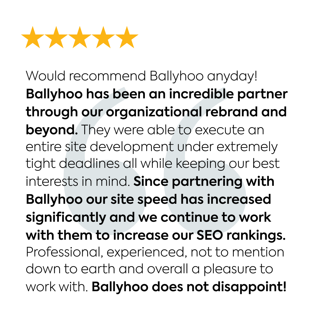
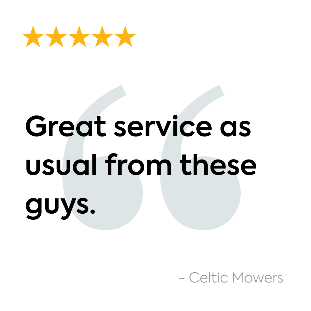
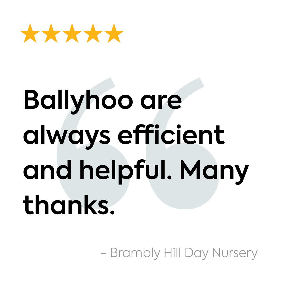
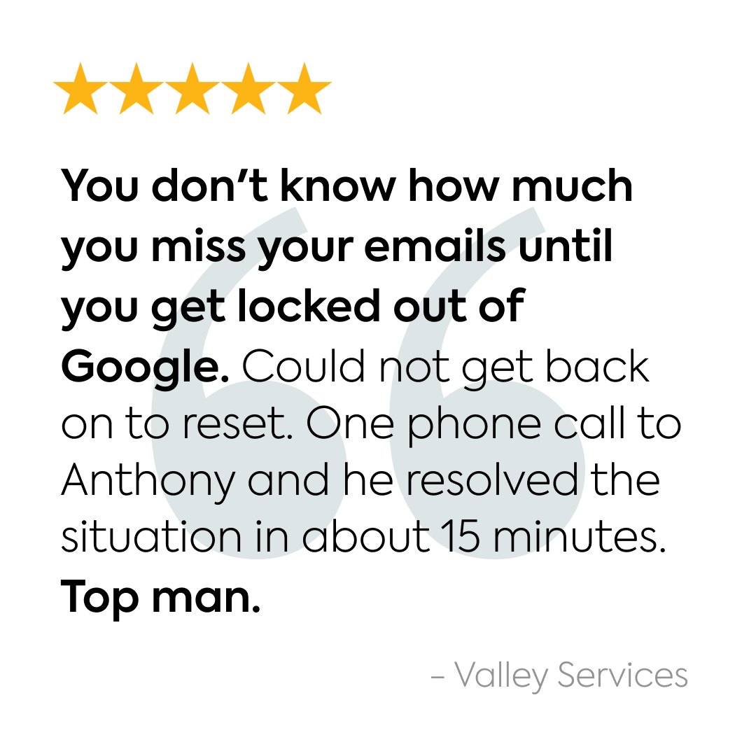
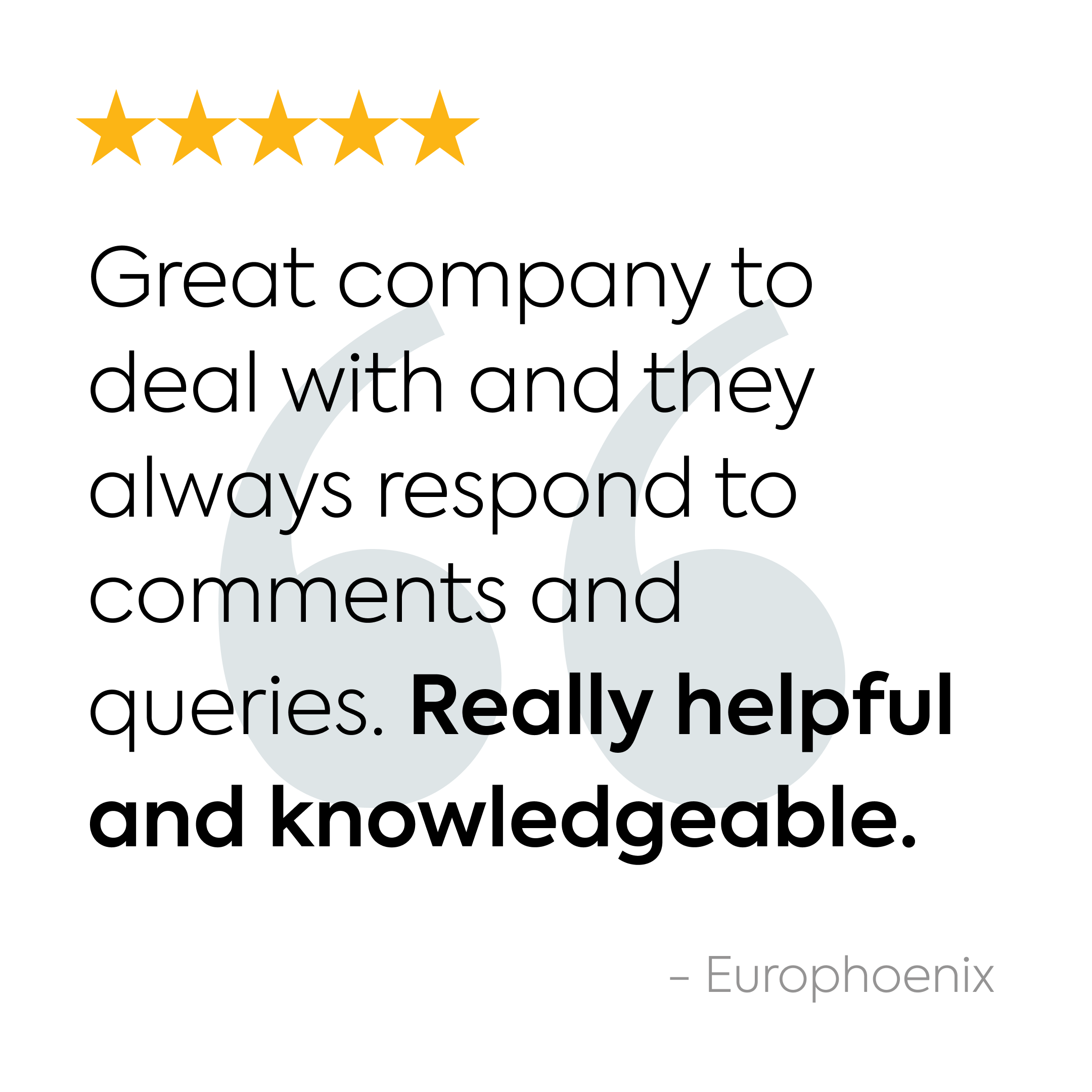
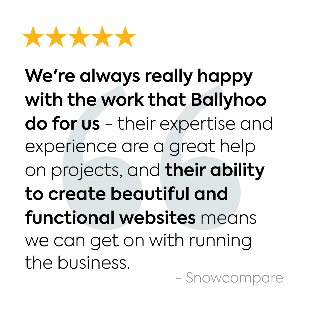
Testimonial Block
“Very professional and personable, and always an extremely quick turnaround time!”
Monika Jagielo
Yorica!
Buttons
Buttons are preferred over text links, except where the text link forms part of a sentence. Use pill buttons as CTAs (call to actions) to encourage users to perform an action such as visiting another page on the website or contacting us.
Pill Buttons
This is an alternative button style on a coloured background.
Social
File
Images
Media & Text
This block is preferred for showing images rather than inserting an image within the content.
The background and text colours are customisable and the image can be aligned left or right. The columns will stack on smaller resolutions.
NB This block also appears in the Layout section of this guide.
Portfolio Slider
Add unlimited images to this block and see a carousel of images. Typically used to break up written content with screenshots of the project.

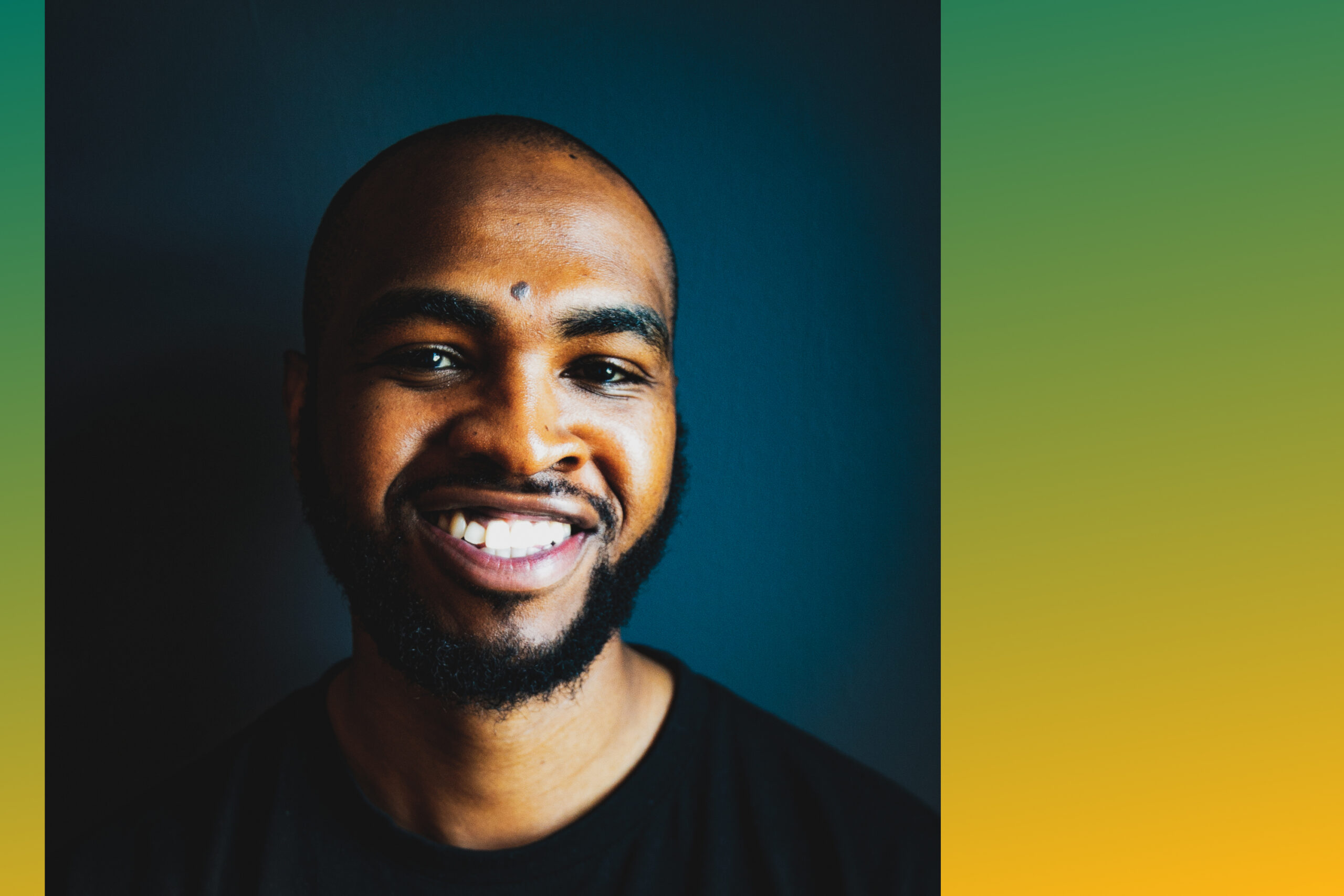
Image Full-Width
The preferred method of using the Image block is to have an image set to full width, select Default to achieve this.

Gallery
Use the Gallery block on blogs when you have many images to display. Set to Full-Width and ideally upload square images to create an Instagram-like aesthetic.
Test Caption 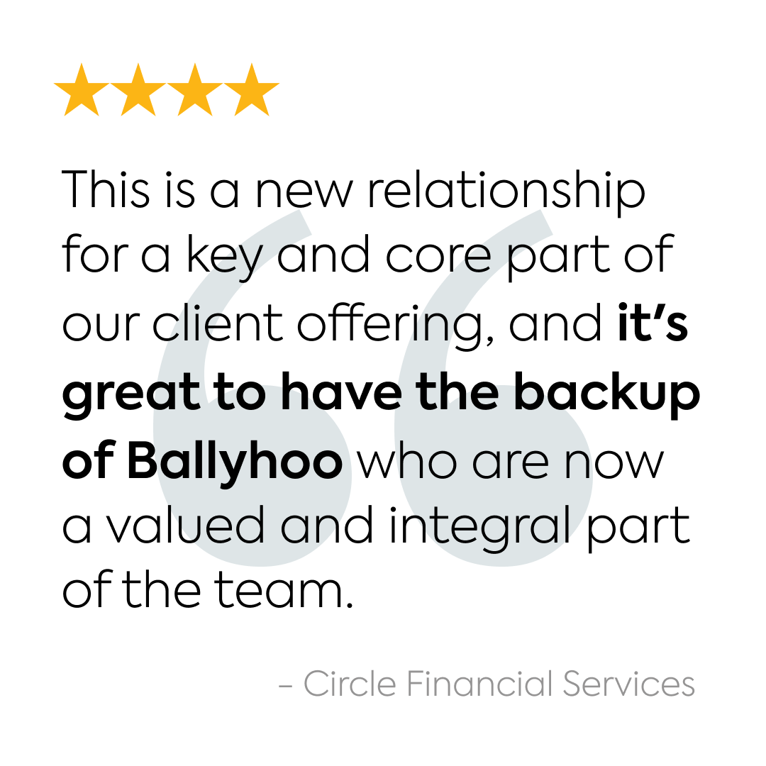


Contact us
Call one of the team on 0121 295 5352 or fill in our contact form, to discuss how we can help you.
Contact us
Send us a quick message and we’ll get right back to you.